Saturday, 29 January 2022

The Boatswain - Sculpt Pt.1

 25-28/01/22 - Week 3

This week was spent starting my second character, The Boatswain. I didn't manage to get everything done this week as Monday was spent finishing my first character and there was some finicky things to sort out in this project so far, and there will be more to come so I think this character will end up taking me a couple more days than I originally planned.

This was the first draft of the head, the head was something that I took a lot of time on in general as I wanted it to look right with the style of the concept. This was the first variant that I left to come to look back on the next day. I used references from traditional African body and facial scarring for the patterns on the face as I could see depth in the concept which led me to believe this was the inspiration/origins of the character's markings.
I tried to get the pointy & defined nature of the style down and did succeed but I felt the overall shape was off.


The next day, trying to understand where I was going wrong, I decided to do some quick sketches to help me understand the face from a front on and side view perspective. I did this a bit for Nia but I tried to put a bit more detail and thought into it here and this ended up really helping, even though my drawings are still a bit off.


I then progressively changed the shape of the head, I also added in the same eyes and eyebrow expression from the concept to help me gauge some of the features, like the eyes that felt very off to me. I found that the structure needed to be more blocky and the eyes needed to be much smaller, eventually, as you can see on the right I managed to get somewhere that read more like the concept.


After reaching this point, I reworked the cheekbones and smoothed some parts out to finalise the face. This outcome is much better and much more like the concept than the first sculpt. The only problem is that this ended up taking me the most part of 2 days so this also put me behind schedule for this week. 


By the end of Wednesday I managed to finish the rough blockout of the body which I then worked on through some of Thursday to define the shapes I saw in the concept. This was tricky to me at some points as I wanted it to still be anatomically correct, but at some points the concept really went against this, finding the balance between the two was hard but in the end I think I am happy with my outcome. As you can see, to save time I didn't define the lower part of the body as this will be covered by clothing.


Thursday and Friday were spent working further into the sculpt, I added some jewellery, the satin wrap and the trousers in. I made a decision with the trousers to make them a bit less low as this would cause a lot of issues when working with rigging and skinning. I think I managed to come to a reasonable compromise with the height of them. The belt ended up taking quite a while as I wasn't using the right tool at first, I was unaware of one of the curve tools that snapped to the form and was instead using a regular cure tool and shaping it to the body manually. Eventually when I was aware of this it allowed me to speed up a bit, but it still took me some time to fix the errors using the previous method and make sure everything looked smooth.
Originally I was going to use marvellous for the trousers but I ended up skipping this out for this project, this is mainly because I was already a couple days behind and creating stylised clothing like this is not really out of my comfort zone so I ended up just sculpting them without the use of marvellous, though I still do want to try to learn this at some point during my FMP.


On Friday I was also given some feedback on the trousers, the folds weren't in the right place and were unrealistic so I quickly found some better reference and reworked these and think I came up with a much better looking item of clothing.
I also started on the shoes and managed to get the basic shape down by the end of the day to try to get myself in a better position for next week.


Overall, This week I tried to make as much progress as I could but some things just take longer than I expect them to. So I have factored these in for next week and will hopefully be done by Thursday, giving myself a couple extra days than initially planned. Some of the things I will be tackling next week like weapons will most likely take me a couple days since I haven't approached weaponry before.


Friday, 21 January 2022

Nia - Sculpt

 17-21/01/22 - Week 1

This week I have started my sculpt for Nia. I first created a couple of groups of images to help me with the style and concepts that I was going for. I wanted to portray a more semi-realistic style, which encludes more realistic proportion whilst still acknowleging its stylised roots. I found these styles were very smooth but counteracted with some slight emphasis on points and included longer arms and legs.


Over the first day I was able to make some good progress, this included getting in the face and some of the block out for the body. I struggled with the face a lot, especially the eyes as I wasn't getting the proportions correct and it just wasn't looking like the reference. I was nearing something that looked correct but I made good progress over the first day and was aware that coming back to it later would be beneficial. 


The next day, I assessed what was wrong with the face in some more detail, I found the eyes were much too big and the face in general lacked structure which I was able to achieve by using a variety of pinch brushes. I also got in the eyelashes and brows to help me understand the issues with the proportions of the face too. To help with the semi-realistic style I got a basic female body sculpt from lightbox and used this to check my anatomy as this needed to be somewhat correct.


I then finished the body, I needed to work a bit into this since some of the material is sheer so you will be able to see the skin underneath. I also created a quick base hair model which really helped me to understand how accurate my sculpt was to the concept, I think I am happy with it. I then sculpted the skull knee assets and applied them to the sculpt.


To start with the clothing, I found some boot examples and based these on her wedge-like shoes which I added some small details to whilst also trying to stay true to the concept. I also sculpted the leotard and boots with there necessary details added in. I didn't want to go too over the top with the stylisation on this sculpt, so there is a lot more subtlety in the boots and leotard than there would have if this was a stylised piece.


To finish her off for this moment, I added in a base for the sheer material on her arms and then added the detailing on the tops of the boots. This was created by masking out an area on a cylinder and then trying to fix the topology as best as possible. The jewellery was mainly easy and was just a case of creating shapes and placing them in the right shape or spot. With the cape this was similar, creating a base mesh and duplicating it. For the future of the cape I am unsure how stylised I want to go with the feathering since I could make it very stylised like on the concept or try to play with alphas for it.


Overall, a super progressive week that will follow into sculpting the boatswain. I hope that the approaches I took were well thought out and will be beneficial for my texturing since there was many wash I could tackle the lace/pattern work.

Here is my plan for the Boatswain next week:


I also want to, as a stretch goal, try to make some crows for Nia since this would look really nice for my presentation, but I am unsure if I'll manage this.

Saturday, 15 January 2022

FMP Planning & Project Start

15/01/22 - Week 1

I've chosen to do the character brief for my FMP project. This involves creating a minimum of 3 characters that are fully rigged, posed and game ready.
I chose to abide closely to the original brief, this time not making my own concepts after getting negative feedback towards my concept for the previous character brief and considering this is my FMP, I didn't really want to take too many risks in terms of how visually appealing and conceptually interesting my work is. 
My main focus then falls back on the quality of the characters I'm creating since I do not have the concept part involved. To compensate, I want to try to learn how to create game ready hair cards in xgen and hopefully get some basic understanding in marvellous too. This should amp up my industry standard techniques and create stronger portfolio pieces.

I started on artstation to find some interesting and appealing concepts or illustrations that I could recreate. I had a few things in mind to narrow down my search which included variations in race, age, body type and importantly to me, style. I didn't want everything to be one style and I hope to recreate the styles of the concepts I have chosen which will provide me with a wider portfolio that shows I am willing to abide to any style, though I am focusing on more stylistic characters.
The search was hard as I had to keep all of these things in mind whilst also thinking about how appealing the concepts were to me and others, I tend to like specific aesthetics and though I have pandered towards that a bit I tried to make it a bit more neutral and appeal to a range of people. Eventually, I found a few that I liked from 3 different artists and I requested their permission to recreate their work in a 3D medium, thankfully I got a response from all of them later that day and they all agreed.
Here are the concepts I have chosen:

My first character I hope to display a more semi-realistic style with more realistic proportions and also definitely include the xgen hair I previously mentioned. There will be challenges with the intricacy on the clothing and the fact that I am more used to a stylistic process now.


The Boatswain - By Venus Bambisa https://www.artstation.com/venusbambisa
My second character is much more stylised, though the style is very specific and "pointy" which will be interesting to replicate. The trousers may be a challenge since it may be difficult rig, so I plan to challenge my rigging skills here.


Soft Blue - By Bergamotik https://www.artstation.com/barmaglotik
My third character is something that is very personally appealing for me, I really like the many details of the design and the soft style. I am most excited for this project, though I have not done anything of this scale or quite like this before so I think it'll definitely push all of my skills.

Moving on from this, I started my plan. As I experienced last term planning was super important and I wanted to try to realistically plan the next 17 weeks ahead of me including 1 for planning (this week) and 1 at the end of the project in case of any problems or last minute things I wanted to add in.
I planned this out in excel and will also be planning in more detail my work every week. The excel document sets out when I hope to finish each segment of the projects, I've decided to work on the projects in unison so I can hopefully get everything done in good timing and not end up with some projects being more worked on than others. 


Monday, 10 January 2022

Cart Final Thoughts

 10/01/22 - Hand In

I have now completed the cart project and here is my final thoughts and evaluation on the project as a whole. 

Starting the cart project, I was quite ambitious and wanted to make a nice shop front scene. I do think, though there ended up being a lot to do, that this was a good idea and it has really improved my scene adding a lot of interest and story to it. I managed to get the block out and base of the high poly for the cart done quickly, though I think the sense of confidence and lack of consideration is what caused this project to have problems and unsolvable problems (for the timeframe, anyway).

Sculpting the cart and fruit was really fun and I enjoyed adding small details and blemishes to both. I definitely am stronger with natural materials and objects rather than hard surface. I tried to make the cart and fruit as accurate as possible so I spent a lot of time adjusting the cart's base to get it correct to the reference photos. I did the same with the fruit and added a lot of small blemishes as well as tried to get the shape of each one as realistic as possible. Wanting this, I spent a long time on the pineapple and decided in the end that I would make the skin a texture, this, I think, was a mistake as the texture warps a lot and doesn't look as accurate as I could have made it as a sculpt in zbrush. Overall, I think the fruit sculpts and cart sculpt is definitely the most successful part of the project and was definitely the most enjoyable part.

Unwrapping really was the start of my problems. I decided to use the budget given as 1x 2048 texture sheet for both the fruit and the cart. Ideally, I would have split this up into 4x512 texture sheets as this would have allowed me to separate a lot of the items, such as the fruit from the baskets. The way I did it just meant that I had issues with baking and importing into painter and was just needlessly complicated especially as I had to add on the baked fruit planes onto the main sheet which just added time for no reason. In the scene overall, it would have also allowed me to have the glass on a separate sheet which would have easily allowed me to add a shader.

I managed to get the lighting done early in the project which was super helpful. I am quite pleased with the lighting though obviously I did change it from this point. I went through a couple of variations for the lighting in the beginning though I found a couple tutorials on how to light night time scenes and this was very helpful, the warm glows with the purple/blue looks really nice. I do doubt that it looks realistic enough though and if this would cause problems with the brief.

Texturing, especially for the fruit and cart, was alright. I enjoyed those two parts but the rest of it seemed long and tedious. I didn't get on too well with the wicker basket texture and it took me a very long time to figure it out to a standard that I felt was somewhat good, I still would like to improve this texture. The cart is definitely my best bit of texturing here as it was of course what I spent the most time on. Eventually I ran out of time and the rest of the scene was a bit rushed and some of it is not up to a standard I am very happy with.
The method I approached with baking the fruit was most likely, wrong. I used the low poly to bake with, which was better in terms of poly count in max but it made it so I lost quite a lot of detail after they were baked. It was, however, my first time baking in marmoset and this taught me a lot about baking using this program and the benefit of it. It worked very well for specifically the shop front, though I wish I'd baked in an emissive.

Another major issue was that I kept forgetting bits and pieces of the project, this was down to lack of detailed planning and its definitely something I've learnt is very important over these past couple of projects. The main one was the foliage which I had to texture very quickly and they do suffer from looking rushed. 

As I closed off this project, I started to notice a lot of these mentioned things and how I could improve and do things a lot better if I were to do it again. This is good as it shows progress but I think things such as the glass, foliage and technical quality pushed this project down quality wise and I wish I has a little more time to fix these things. Though in some ways I feel I would need to redo a lot of this project to fix parts of it.
I don't plan to do environments for my FMP as I just don't enjoy most of it, I mainly enjoy texturing and sculpting which I feel is a much more major part of characters.
Overall, this was a very telling project and though I feel that the quality in some areas such as the fruit and cart itself has potential, I don't feel the overall quality is up to the standard that I initially wanted.


Captain Final Thoughts

10/01/22 - Hand In

I have now completed the captain character project and here is my final thoughts and evaluation on the project as a whole.

This project started off well, I still like the idea I had and the design overall had strong shape and to me, clearly resembled a fisherwoman. I had some feedback over the project here and there and I became less confident in my design over time, some felt it didn't have enough research and thought behind this. The design wasn't really supposed to be the focus of my character and its definitely something I struggle with in general, this has only really told me that I should outsource designs for my FMP as it's not my strong point. I do feel that it lacks the sense of story that the brief required, and I should have perhaps tried to focus a bit more on this aspect and add some specific historic detail here and there.

The sculpt is definitely something I'm proud of. It was my second character sculpt and I can see the improvement and expansion of zbrush knowledge, I do want to challenge myself with adding more smaller details next time. As this was my first stylised sculpt, I had a lot to learn about stylised folds and hair specifically. I got feedback on this and it became apparent that I needed to have delved more into how to create these and research and gather much more reference on what sort of shape language I was going for. This resulted in me having to redo the folds a couple of times which lost me a lot of time, and in the end I still managed to lose a lot of the silhouette and charm of the original design from trying to revert back to a more realistic approach.

I also ended up having some problems with my retop, I tried to save as much as possible which wasn't helpful and I realise now where it would have been better for deformation and smoothing to implement more topology. Overall, the character is much more low poly than I would have liked and would have benefitted, especially in the final presentation from cleaner, more dense topology.

I'm quite pleased with the texturing as not only was I able to finish it to a reasonable time, I think it has the right sense of stylisation that I was going for in my project. Something I would have liked to improve is the eyes since I could have implemented more industry standard techniques and had multiple meshes coving the eyeball. This would have really improved the texturing and presentation for my character. I took a lot of care with the texturing and tried to research it as best as possible and I think this paid off, though there is still room to improve especially with the netting. The way I approached the netting makes the whole thing look quite armature and I think it brings the overall presentation down. If I were to do this again I would have instead tried to make it a mesh instead of a texture and added more layers in to make it seem more realistic.

The overall look of the character in its presented form is definitely an improvement to my first character in many ways, including lighting, pose and presentation of skill. I definitely enjoyed this more than my cart project so I would like to take characters forward into my FMP. I need to consider all the strengths I have here and improve on my weaknesses thoroughly to make sure I can display my skill and abilities.
I learnt a lot and sped up some of my skills massively, so though I am confident for those reasons, there is still a lot for me to learn and understand as I move onto the next set of projects.


Thursday, 6 January 2022

Presenting the Cart

 05-06/01/22 - Week 14

For the cart's presentation, I wanted to continue with the lighting I had set up before, add in my final models and textures and possibly add in a particle system.
Before I imported everything, I quickly sorted out the issue with the plums mentioned before, deleted some topology on the fruit that wasn't showing to create more room in the budget, and added in the pineapple leaves which I had somehow forgotten about until now. I ended up with a tri count of around 5.5k which I felt was acceptable for the tri budget given, this means that my cart is around 8k, 500 extra tris on each part of the model than the suggested.


I found some issues almost instantly for the cart project, I had a lot of issues with lighting and errors that were presented in the log. These were mainly a combination of overlapping lighting maps and "wrapping" uvs on the lightmap. I hadn't come across the latter but it was basically the same fix as the former so it wasn't too difficult to fix in the end. The main issues came with the cart's light maps, I hadn't set them up before merging my fruit, baskets and foliage so I tried to just adjust it with it merged but I had found that as I had merged it had messed with my mesh quite badly and even xforming and unmerging everything still caused problems. When trying to unwrap it would consistently crash the program, and the auto-generated maps weren't any better. In the end, I had to solve this by making the fruit part of the cart a stationary mesh instead of static. As far as I can tell, this doesn't effect the mesh apart from it being a bit less efficient since it doesn't use a light map and the lighting is processed much like a stationary light source. Hopefully this is an acceptable quick fix that does not effect the efficiency too highly. This has taught me that I need to think about light maps earlier on and create them as I am unwrapping instead of coming back to it when I need to.


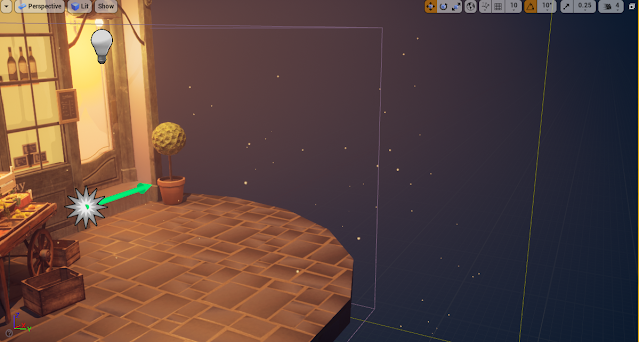
After fixing my light map errors, I moved on to adjusting the lighting to the final variant. I didn't think I'd end up changing much but in the end I moved the main "street light" to the middle to get better lighting on the cart and changed the rect light in the door to a point light. I then felt something was missing - I wanted the light coming from the door and shopfront window to be glowing more realistically as if a light was on inside, this would help the realism. I achieved this by creating an alpha map in my shop front textures for the area around the bottles and added in a colour to my materials for the emissive colour, making the alpha the emissive opacity. For the door I just added a plane and added the same material for the light, adjusting it slightly using a mat instance.

I then added in a cascade fx, this was the same idea for the character project and had a lot of the same settings implemented to make it look like a dust of sorts. I made it a warm orange to match the lighting's glow. I feel this made the project a lot more peaceful and serene. 


Overall, I'm very happy with the results of the lighting and how I was able to overcome some of the problems that were presented. If I could, I would have perhaps spent a bit longer on it tweaking and improving things such as the particle fx and glass especially, as this didn't turn out as I wanted it in many ways. I should have kept the glass to its own map so I could mess with the shader individually instead of having to keep in mind the non-glass objects on the texture sheet.


Tuesday, 4 January 2022

Presenting the Character

 03-04/01/22 - Week 14

Now I've posed the character and given her a bit of life, I moved onto presenting her in primarily unreal with some work in marmoset for portfolio pieces.
I firstly imported everything into unreal and set up the animations, this was quite basic as it was just a case of selecting the correct timing for the pose then adding on the morph target by adding another animation cycle. 


I wanted to work with my lighting to connotate the sea and the fact that she is a captain. To achieve this I did some research on artstation for the sort of lighting I wanted. I found a lot of pirate/ship captains had at least one strong blue light on a deep coloured background.
I thought to contrast the blue lighting with a warm yellow/orange as I thought this would be like the reflection of sand or light from the sun.
I chose the blue to be the strongest light on the left side as I wasn't a big fan of the large shadow from the hand being casted onto the face as it was distracting and the shadow itself was rather blotchy. My lighting ended up consisting of 4 point lights and exponential height fog to add bloom to the lights, making them softer and adding some depth to the lighting in the background.
I'm quite happy with the lighting I created in unreal as I think it highlights a lot of the best features of the character such as the clothing and also gives a sort of spotlight effect which I feel speaks for the captain side.


To add a little bit more depth to the project, I wanted to add a small particle sequence that resembled dust or fireflies which I managed just through changing some basic cascade settings, the lifetime, spawn and location being the most important. This really added some nice ambience to the scene and filled a lot of empty space, adding more interest to the scene.
I am a bit worried that they look a bit like stars or don't really relate to the scene, but I made them blue to try to make it like sea spray or something of the sort.


The final result with the lighting and particle fx is something I'm quite pleased with but I do worry that I have not made it "sea-like" or related enough to the character itself. I do still feel that it displays the textures and pose of the character nicely though, and the supporting meshes help to fill out the scene and tell you more about the character, putting some context in.


I tried to recreate this quickly in marmoset, with some slightly adjusted colours/lighting positioning as I wanted the a-pose to be displayed so the lighting wouldn't have translated too well. I went for a more tones down lighting scene that looked a bit more like she was perhaps on a boat at night, with the oranges being much more rich and the blues having a bit. more green in it. This is mainly for marmoset viewer use so I didn't spend too much time adjusting things here.


Sunday, 2 January 2022

Rigging, Skinning and Posing the Captain

 29-31/12/21 - Week 13

To finish off the character before creating the unreal scene I wanted to pose my character. I used max for this and also created a morph target for the facial features.


I first started by rigging my character, I decided to add some bones for each of the ponytails so I could pose them properly. Originally I was going to add some for the ropes but since I am not entirely confident with rigging I decided to leave it for this project.


I then created my pose along with a few others and tested my character with the base colour attached, this was to make sure I fully ironed out most of/all of the incorrect skinning. Most of these issues were with the arms and hair. I chose quite an extreme pose for the left arm, which meant that it took me a while to make this look somewhat normal. The hair also took a while as I found parts were attached to lots of different parts and I also needed to play about with the top part of each ponytail and how much this was attached to the head.
Once I'd finished, this was the result I got which I was pretty happy with. I was trying to recreate the pose from my original concept and though I found that in some places this was a bit impossible since my anatomy isn't the best, I created a pose that had the adventurous and bold feel that I was trying to convey.


I then tried to add in the morph target. This is where I was experiencing issues.
Morph targets must have the same amounts of verts that are the exact same as the original mesh. I didn't understand how to separate the head from the body since it was animated and skinned, and this would in effect break the skinning. So the only option was to duplicate the entire body and then just edit the face to how I wanted it. Once I did this though, it basically broke my animation.


After getting this result, obviously something wasn't working as it should. After trying to find help on the glitch and trying many different work arounds I eventually found that the reason why my model was doing this was because obviously my morph target was posed in animation, so once put on the keyframe where my morph target was in the same animation as the original model, it would basically double the animation. This is why it looked like this.
This only means that my morph target is now sort of my animation slider. This is not ideal but it still works and I will just have to be even more careful next time so that my character has a proper animation slider.
However, for this project this is suitable and I have a fully rigged and posed character with a facial expression. Without this I think it would have made the character look a lot more "dead". I am looking forward to seeing this character fully lit and properly presented.


Soft Blue - Final Review

06/05/22 - Week 17 Now that I have finished my projects I will review them over and see where I went wrong, could have improved or what I am...