Showing posts with label Professional Practice. Show all posts

Monday, 10 January 2022

Cart Final Thoughts

 10/01/22 - Hand In

I have now completed the cart project and here is my final thoughts and evaluation on the project as a whole. 

Starting the cart project, I was quite ambitious and wanted to make a nice shop front scene. I do think, though there ended up being a lot to do, that this was a good idea and it has really improved my scene adding a lot of interest and story to it. I managed to get the block out and base of the high poly for the cart done quickly, though I think the sense of confidence and lack of consideration is what caused this project to have problems and unsolvable problems (for the timeframe, anyway).

Sculpting the cart and fruit was really fun and I enjoyed adding small details and blemishes to both. I definitely am stronger with natural materials and objects rather than hard surface. I tried to make the cart and fruit as accurate as possible so I spent a lot of time adjusting the cart's base to get it correct to the reference photos. I did the same with the fruit and added a lot of small blemishes as well as tried to get the shape of each one as realistic as possible. Wanting this, I spent a long time on the pineapple and decided in the end that I would make the skin a texture, this, I think, was a mistake as the texture warps a lot and doesn't look as accurate as I could have made it as a sculpt in zbrush. Overall, I think the fruit sculpts and cart sculpt is definitely the most successful part of the project and was definitely the most enjoyable part.

Unwrapping really was the start of my problems. I decided to use the budget given as 1x 2048 texture sheet for both the fruit and the cart. Ideally, I would have split this up into 4x512 texture sheets as this would have allowed me to separate a lot of the items, such as the fruit from the baskets. The way I did it just meant that I had issues with baking and importing into painter and was just needlessly complicated especially as I had to add on the baked fruit planes onto the main sheet which just added time for no reason. In the scene overall, it would have also allowed me to have the glass on a separate sheet which would have easily allowed me to add a shader.

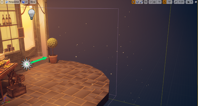
I managed to get the lighting done early in the project which was super helpful. I am quite pleased with the lighting though obviously I did change it from this point. I went through a couple of variations for the lighting in the beginning though I found a couple tutorials on how to light night time scenes and this was very helpful, the warm glows with the purple/blue looks really nice. I do doubt that it looks realistic enough though and if this would cause problems with the brief.

Texturing, especially for the fruit and cart, was alright. I enjoyed those two parts but the rest of it seemed long and tedious. I didn't get on too well with the wicker basket texture and it took me a very long time to figure it out to a standard that I felt was somewhat good, I still would like to improve this texture. The cart is definitely my best bit of texturing here as it was of course what I spent the most time on. Eventually I ran out of time and the rest of the scene was a bit rushed and some of it is not up to a standard I am very happy with.
The method I approached with baking the fruit was most likely, wrong. I used the low poly to bake with, which was better in terms of poly count in max but it made it so I lost quite a lot of detail after they were baked. It was, however, my first time baking in marmoset and this taught me a lot about baking using this program and the benefit of it. It worked very well for specifically the shop front, though I wish I'd baked in an emissive.

Another major issue was that I kept forgetting bits and pieces of the project, this was down to lack of detailed planning and its definitely something I've learnt is very important over these past couple of projects. The main one was the foliage which I had to texture very quickly and they do suffer from looking rushed. 

As I closed off this project, I started to notice a lot of these mentioned things and how I could improve and do things a lot better if I were to do it again. This is good as it shows progress but I think things such as the glass, foliage and technical quality pushed this project down quality wise and I wish I has a little more time to fix these things. Though in some ways I feel I would need to redo a lot of this project to fix parts of it.
I don't plan to do environments for my FMP as I just don't enjoy most of it, I mainly enjoy texturing and sculpting which I feel is a much more major part of characters.
Overall, this was a very telling project and though I feel that the quality in some areas such as the fruit and cart itself has potential, I don't feel the overall quality is up to the standard that I initially wanted.


Captain Final Thoughts

10/01/22 - Hand In

I have now completed the captain character project and here is my final thoughts and evaluation on the project as a whole.

This project started off well, I still like the idea I had and the design overall had strong shape and to me, clearly resembled a fisherwoman. I had some feedback over the project here and there and I became less confident in my design over time, some felt it didn't have enough research and thought behind this. The design wasn't really supposed to be the focus of my character and its definitely something I struggle with in general, this has only really told me that I should outsource designs for my FMP as it's not my strong point. I do feel that it lacks the sense of story that the brief required, and I should have perhaps tried to focus a bit more on this aspect and add some specific historic detail here and there.

The sculpt is definitely something I'm proud of. It was my second character sculpt and I can see the improvement and expansion of zbrush knowledge, I do want to challenge myself with adding more smaller details next time. As this was my first stylised sculpt, I had a lot to learn about stylised folds and hair specifically. I got feedback on this and it became apparent that I needed to have delved more into how to create these and research and gather much more reference on what sort of shape language I was going for. This resulted in me having to redo the folds a couple of times which lost me a lot of time, and in the end I still managed to lose a lot of the silhouette and charm of the original design from trying to revert back to a more realistic approach.

I also ended up having some problems with my retop, I tried to save as much as possible which wasn't helpful and I realise now where it would have been better for deformation and smoothing to implement more topology. Overall, the character is much more low poly than I would have liked and would have benefitted, especially in the final presentation from cleaner, more dense topology.

I'm quite pleased with the texturing as not only was I able to finish it to a reasonable time, I think it has the right sense of stylisation that I was going for in my project. Something I would have liked to improve is the eyes since I could have implemented more industry standard techniques and had multiple meshes coving the eyeball. This would have really improved the texturing and presentation for my character. I took a lot of care with the texturing and tried to research it as best as possible and I think this paid off, though there is still room to improve especially with the netting. The way I approached the netting makes the whole thing look quite armature and I think it brings the overall presentation down. If I were to do this again I would have instead tried to make it a mesh instead of a texture and added more layers in to make it seem more realistic.

The overall look of the character in its presented form is definitely an improvement to my first character in many ways, including lighting, pose and presentation of skill. I definitely enjoyed this more than my cart project so I would like to take characters forward into my FMP. I need to consider all the strengths I have here and improve on my weaknesses thoroughly to make sure I can display my skill and abilities.
I learnt a lot and sped up some of my skills massively, so though I am confident for those reasons, there is still a lot for me to learn and understand as I move onto the next set of projects.


Thursday, 6 January 2022

Presenting the Cart

 05-06/01/22 - Week 14

For the cart's presentation, I wanted to continue with the lighting I had set up before, add in my final models and textures and possibly add in a particle system.
Before I imported everything, I quickly sorted out the issue with the plums mentioned before, deleted some topology on the fruit that wasn't showing to create more room in the budget, and added in the pineapple leaves which I had somehow forgotten about until now. I ended up with a tri count of around 5.5k which I felt was acceptable for the tri budget given, this means that my cart is around 8k, 500 extra tris on each part of the model than the suggested.


I found some issues almost instantly for the cart project, I had a lot of issues with lighting and errors that were presented in the log. These were mainly a combination of overlapping lighting maps and "wrapping" uvs on the lightmap. I hadn't come across the latter but it was basically the same fix as the former so it wasn't too difficult to fix in the end. The main issues came with the cart's light maps, I hadn't set them up before merging my fruit, baskets and foliage so I tried to just adjust it with it merged but I had found that as I had merged it had messed with my mesh quite badly and even xforming and unmerging everything still caused problems. When trying to unwrap it would consistently crash the program, and the auto-generated maps weren't any better. In the end, I had to solve this by making the fruit part of the cart a stationary mesh instead of static. As far as I can tell, this doesn't effect the mesh apart from it being a bit less efficient since it doesn't use a light map and the lighting is processed much like a stationary light source. Hopefully this is an acceptable quick fix that does not effect the efficiency too highly. This has taught me that I need to think about light maps earlier on and create them as I am unwrapping instead of coming back to it when I need to.


After fixing my light map errors, I moved on to adjusting the lighting to the final variant. I didn't think I'd end up changing much but in the end I moved the main "street light" to the middle to get better lighting on the cart and changed the rect light in the door to a point light. I then felt something was missing - I wanted the light coming from the door and shopfront window to be glowing more realistically as if a light was on inside, this would help the realism. I achieved this by creating an alpha map in my shop front textures for the area around the bottles and added in a colour to my materials for the emissive colour, making the alpha the emissive opacity. For the door I just added a plane and added the same material for the light, adjusting it slightly using a mat instance.

I then added in a cascade fx, this was the same idea for the character project and had a lot of the same settings implemented to make it look like a dust of sorts. I made it a warm orange to match the lighting's glow. I feel this made the project a lot more peaceful and serene. 


Overall, I'm very happy with the results of the lighting and how I was able to overcome some of the problems that were presented. If I could, I would have perhaps spent a bit longer on it tweaking and improving things such as the particle fx and glass especially, as this didn't turn out as I wanted it in many ways. I should have kept the glass to its own map so I could mess with the shader individually instead of having to keep in mind the non-glass objects on the texture sheet.


Tuesday, 4 January 2022

Presenting the Character

 03-04/01/22 - Week 14

Now I've posed the character and given her a bit of life, I moved onto presenting her in primarily unreal with some work in marmoset for portfolio pieces.
I firstly imported everything into unreal and set up the animations, this was quite basic as it was just a case of selecting the correct timing for the pose then adding on the morph target by adding another animation cycle. 


I wanted to work with my lighting to connotate the sea and the fact that she is a captain. To achieve this I did some research on artstation for the sort of lighting I wanted. I found a lot of pirate/ship captains had at least one strong blue light on a deep coloured background.
I thought to contrast the blue lighting with a warm yellow/orange as I thought this would be like the reflection of sand or light from the sun.
I chose the blue to be the strongest light on the left side as I wasn't a big fan of the large shadow from the hand being casted onto the face as it was distracting and the shadow itself was rather blotchy. My lighting ended up consisting of 4 point lights and exponential height fog to add bloom to the lights, making them softer and adding some depth to the lighting in the background.
I'm quite happy with the lighting I created in unreal as I think it highlights a lot of the best features of the character such as the clothing and also gives a sort of spotlight effect which I feel speaks for the captain side.


To add a little bit more depth to the project, I wanted to add a small particle sequence that resembled dust or fireflies which I managed just through changing some basic cascade settings, the lifetime, spawn and location being the most important. This really added some nice ambience to the scene and filled a lot of empty space, adding more interest to the scene.
I am a bit worried that they look a bit like stars or don't really relate to the scene, but I made them blue to try to make it like sea spray or something of the sort.


The final result with the lighting and particle fx is something I'm quite pleased with but I do worry that I have not made it "sea-like" or related enough to the character itself. I do still feel that it displays the textures and pose of the character nicely though, and the supporting meshes help to fill out the scene and tell you more about the character, putting some context in.


I tried to recreate this quickly in marmoset, with some slightly adjusted colours/lighting positioning as I wanted the a-pose to be displayed so the lighting wouldn't have translated too well. I went for a more tones down lighting scene that looked a bit more like she was perhaps on a boat at night, with the oranges being much more rich and the blues having a bit. more green in it. This is mainly for marmoset viewer use so I didn't spend too much time adjusting things here.


Sunday, 2 January 2022

Rigging, Skinning and Posing the Captain

 29-31/12/21 - Week 13

To finish off the character before creating the unreal scene I wanted to pose my character. I used max for this and also created a morph target for the facial features.


I first started by rigging my character, I decided to add some bones for each of the ponytails so I could pose them properly. Originally I was going to add some for the ropes but since I am not entirely confident with rigging I decided to leave it for this project.


I then created my pose along with a few others and tested my character with the base colour attached, this was to make sure I fully ironed out most of/all of the incorrect skinning. Most of these issues were with the arms and hair. I chose quite an extreme pose for the left arm, which meant that it took me a while to make this look somewhat normal. The hair also took a while as I found parts were attached to lots of different parts and I also needed to play about with the top part of each ponytail and how much this was attached to the head.
Once I'd finished, this was the result I got which I was pretty happy with. I was trying to recreate the pose from my original concept and though I found that in some places this was a bit impossible since my anatomy isn't the best, I created a pose that had the adventurous and bold feel that I was trying to convey.


I then tried to add in the morph target. This is where I was experiencing issues.
Morph targets must have the same amounts of verts that are the exact same as the original mesh. I didn't understand how to separate the head from the body since it was animated and skinned, and this would in effect break the skinning. So the only option was to duplicate the entire body and then just edit the face to how I wanted it. Once I did this though, it basically broke my animation.


After getting this result, obviously something wasn't working as it should. After trying to find help on the glitch and trying many different work arounds I eventually found that the reason why my model was doing this was because obviously my morph target was posed in animation, so once put on the keyframe where my morph target was in the same animation as the original model, it would basically double the animation. This is why it looked like this.
This only means that my morph target is now sort of my animation slider. This is not ideal but it still works and I will just have to be even more careful next time so that my character has a proper animation slider.
However, for this project this is suitable and I have a fully rigged and posed character with a facial expression. Without this I think it would have made the character look a lot more "dead". I am looking forward to seeing this character fully lit and properly presented.


Tuesday, 28 December 2021

Baking onto Planes

 27-28/12/21 - Week 13

Using marmoset, I have been baking my fruit and shop window to finish off my texturing.
I haven't really used marmoset to bake before so it was interesting to learn how to do this and the differences between how this works compared to painter.

I started with the shop window plane, I decided to just bake on the items, shelves and wall texture as I thought it would be nice to have the window and window details for a bit of extra depth. To bake this it was just a case of putting all of my high poly models into the high section of the baker and then a copy of the back wall plane onto the low. I then checked all the boxes of the maps I wanted baked, this included albedo to allow me to bake the textures I had already created.

This was the result, which I am really pleased with. I was a bit worried it wouldn't look too good but it actually looks rather acceptable for a singular plane. Obviously the map sizes are bumped up a bit but I'm still happy with the results of this process.


Now knowing this was a good method to use, I moved on to the fruit. I separated some of them that I felt would look better being on their own on top, then tried to bake like before however I did encounter some baking errors. They mainly occurred on the oranges as the apples were bleeding on to the orange textures since my cage was rather big, I fixed this just by moving the mesh further away which wasn't an issue. I was also experiencing some skewing which was quite easy to fix in marmoset. By going into the paint skew option, you can make it so your normals are facing the way you want it to to get a much smoother and logical bake. After fixing these problems and tweaking my cage a bit I was able to get a good result.
These planes will be added to my fruit + basket uv sheet. I had somehow forgotten that this would be something to consider though managed to fix my sheet before I textured the baskets so not a huge problem. When doing this I did forget to add in the plums. I decided with the combination of already texturing my baskets and crates and being low on poly count, to just maybe have some plums on top of the box instead of going over on the texture budget or spending more time retexturing.


This was the result of my bake, I don't think its perfect but I don't feel as though my fruit look too much like they are "swimming". The worst outcome from these is probably the apples in the wooden crates since they have a bit more volume to them before, but the other planes look good and once in all the baskets I think will be successful. One thing I need to sort is the tri count as I am currently pushing it and I will need some more for the pineapples and plums, so editing this down a bit once I have put everything together will be the next step.


I quickly textured the citrus leaf foliage for this next step so I could do everything together.

To do so, I used photoshop and erased the areas around each plane that was unnecessary and merged/placed the ao, roughness and metallic in the corresponding RGB channels. The RGB channels were definitely the hardest to do as they were a bit finnicky. This method turned out ok but I will need to do some testing in unreal to see if I have correctly erased everything in the right areas. This wont be too difficult to fix if this happens as I have the originals of each files.
Here is an example of me doing this:
The original file:
The file after adding the fruit planes' + foliage's ao, roughness and metallic into each channel:

If I were to do this project again I definitely would have made it much easier for myself by having multiple 512 textures instead of 1 singular 2048 as it has brought much problems onto me. This could have been done automatically if I had all the fruit planes on their own texture sheet and also would have resolved baking and texturing problems with the fruit and the crates as they also could have had their own maps.
Overall, I'm glad this method has appeared to work but there I wish I would have approached it more thoughtfully and carefully.


Friday, 24 December 2021

Texturing the Cart & Shopfront

 17-24/12/21 - Week 11/12

Over these past few days, I have begun texturing for the cart project after creating my base materials.
I first started with the cart since I felt this was the most important factor of the project and getting this done would be very helpful.


This is probably the part I am most pleased with, it was mainly just a case of studying where the dirt and flaws lay on the references and trying to recreate this. I ended up using quite a lot of hand painting and different grunges with a lot of roughness variation to get the colour and age of the wood correct.


Next, I moved on to the fruit. These were pretty fun to texture though did take me a while as it took me a lot of time to make sure each one looked how I wanted it to. The pineapple skin texture was definitely helpful and I like how it looks but the unwrap caused the texture to warp quite harshly and I couldn't find a way to fix this. Obviously the fruit are quite small on the map so it was hard to get a lot of detail onto them, but I still think what I have created is sufficient.


The crates and baskets where probably the hardest of the lot as I had to play with transparency and also create some textures for the cardboard boxes. I ended up creating the transparency by making a normals map with very small parameters whilst I was baking with opacity, this allowed me to create islands that I could take into photoshop and easily make the parts I wanted white and the parts I didn't, black. I then just applied this as a texture making it an opacity mask.
Both wooden boxes just needed some age added to them and I also added the staples or nails using the pre-existing painter functions. The wicker basket was rather similar though I did struggle a bit with how I had unwrapped it as it was causing the texture to be warped on each side so I ended up having to have many variations of my base material to correct it.
For the cardboard boxes I went into photoshop and tried to recreate the fruit textures that I saw on the reference just as I felt it added some bright colours and a lot more realism, this didn't end up being too difficult. Once I'd finished this was just a case of adding it as a texture to painter and sizing it.


The shop was interesting to texture as I noticed on my reference that it had a sort of gradient and this was hard to balance as I wanted it to show but too harsh would make it appear washed out and confusing. I chose a fake name and slogan for my shopfront and tried to get it as close to that timeframe's fonts and style. I struggled a bit to get this to make this look interesting but I think I managed to figure it out in the end.


I also textured the bottles and shelving to prepare for baking this onto a plane for my shopfront window. I made very basic or altered versions of the bottles, cans and pots that I could see in my reference and made a couple variations so that the shop would look more realistic and full. I plan to bake this plane and the fruit in marmoset.


I also somehow forgot that I would be texturing the foliage and I had also forgotten one of my wooden crate props, so I decided to throw this onto what will be a 512 sheet and texture it. This is quite frustrating as I definitely had room on at least one of my texture sheets, I have been finding some glitches when trying to add geometry to the file in painter however, so I thought this way would be quicker and easier.
I had some issues with baking here as when I exported from zbrush I didn't decimate the tree leaves enough so I ended up with a very high poly mesh. I tried doing this in marmoset at first as I know it is better for baking onto planes but I didn't think the results were good enough, so instead I used painter. It did take a while to bake but after playing with some settings I was able to get a nice bake. I plan to use the singular leaf plane to apply to the tree to make it look more realistic and interesting.

Overall, I am pleased with most of my textures though I did experience some issues or some things that I didn't remember to counter in. A lot of this was to do with how I had split my maps up and was trying to texture, namely the fruit and baskets. I decided to bring in the fruit first then later add my crates. This provided problems as it messed up a lot of my masks. I didn't realise that painter uses "world space" and not the uv's for physical paint, which I had a lot of, and would basically clear all my masks. It was rather frustrating though in the end I managed to come up with a work around.
These small problems cost me a lot of time and I think I was quite slow texturing everything as a whole. Next, I will move on to baking the groups of fruit and shop front to get my project finalised and ready to present in unreal.


Thursday, 16 December 2021

Creating Materials for the Cart

15-16/12/21 - Week 11

Before starting to texture my cart & scene, I needed to create some materials in designer. There ended up being quite a few of these which are all very important.

I started out with the most important of these, the material for the cart. I studied the cart and with the knowledge that these textures are purely just a base material, I generalised the roughness, colour and pattern. To create this, it was just a basic wood pattern with a bit of a shiny roughness and some slight gradient on the colour/roughness to hopefully make it a bit easier to create the gradients you can see on each plank of wood.


The ease of the wood was very much contrasted by the difficulty I had with the wicker baskets. The weaving on the majority of the basket wasn't too hard and I ended up making it by just using the weave generator. What was difficult here was trying to make them look more round, since the weave generator could only produce a straight pattern. I tried to use some levels and shading techniques to try to get it to look more like my references but in the end I left it as it was, adding some roughness variation, warp and defects to make it look more realistic. I am a bit disappointed I didn't get this more accurate.


Increasingly difficult was the tops of the basket, they have a different type of weave that I just couldn't recreate for some reason. Eventually I found a tutorial for some rope that had the same sort of pattern, this included warping a circle and mirroring to create the elongated s shape curve. I had tried many ways of creating this including warping lines and other shapes but eventually I managed to create the shape I wanted. Though again, this is not perfect.


To create a texture for some of the wooden crates, it was a very simple case of warping some noise to create the splintery cheap wood texture.


Again moving on to something a bit more complicated was the texture for the pineapple. I was having a tough time trying to create the 5/6 sided shape and getting it to tile correctly. In the end I had to go with a 6 sided shape and it was a little less realistic. I then just combined many shapes and gradients through trial and error to try to recreate the surprisingly complex skin of a pineapple. Adding colour to this was difficult as it took me quite a long time to get the colours looking something like a pineapple. I am hoping once this is applied to the fruit and how far it will be scaled down it will look a lot more realistic and readable as a pineapple.


Finally, to finish off with an easy one, I created the painted wood texture for the shop front. This was very simple but I did end up making it a bit more peeling and old than the reference shows as I thought that this would help add a lot of variation immediately instead of trying to add more generators and smart masks once in painter.


Soft Blue - Final Review

06/05/22 - Week 17 Now that I have finished my projects I will review them over and see where I went wrong, could have improved or what I am...