Tuesday 28 December 2021

Baking onto Planes

 27-28/12/21 - Week 13

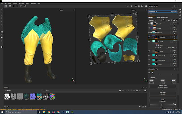
Using marmoset, I have been baking my fruit and shop window to finish off my texturing.
I haven't really used marmoset to bake before so it was interesting to learn how to do this and the differences between how this works compared to painter.

I started with the shop window plane, I decided to just bake on the items, shelves and wall texture as I thought it would be nice to have the window and window details for a bit of extra depth. To bake this it was just a case of putting all of my high poly models into the high section of the baker and then a copy of the back wall plane onto the low. I then checked all the boxes of the maps I wanted baked, this included albedo to allow me to bake the textures I had already created.

This was the result, which I am really pleased with. I was a bit worried it wouldn't look too good but it actually looks rather acceptable for a singular plane. Obviously the map sizes are bumped up a bit but I'm still happy with the results of this process.


Now knowing this was a good method to use, I moved on to the fruit. I separated some of them that I felt would look better being on their own on top, then tried to bake like before however I did encounter some baking errors. They mainly occurred on the oranges as the apples were bleeding on to the orange textures since my cage was rather big, I fixed this just by moving the mesh further away which wasn't an issue. I was also experiencing some skewing which was quite easy to fix in marmoset. By going into the paint skew option, you can make it so your normals are facing the way you want it to to get a much smoother and logical bake. After fixing these problems and tweaking my cage a bit I was able to get a good result.
These planes will be added to my fruit + basket uv sheet. I had somehow forgotten that this would be something to consider though managed to fix my sheet before I textured the baskets so not a huge problem. When doing this I did forget to add in the plums. I decided with the combination of already texturing my baskets and crates and being low on poly count, to just maybe have some plums on top of the box instead of going over on the texture budget or spending more time retexturing.


This was the result of my bake, I don't think its perfect but I don't feel as though my fruit look too much like they are "swimming". The worst outcome from these is probably the apples in the wooden crates since they have a bit more volume to them before, but the other planes look good and once in all the baskets I think will be successful. One thing I need to sort is the tri count as I am currently pushing it and I will need some more for the pineapples and plums, so editing this down a bit once I have put everything together will be the next step.


I quickly textured the citrus leaf foliage for this next step so I could do everything together.

To do so, I used photoshop and erased the areas around each plane that was unnecessary and merged/placed the ao, roughness and metallic in the corresponding RGB channels. The RGB channels were definitely the hardest to do as they were a bit finnicky. This method turned out ok but I will need to do some testing in unreal to see if I have correctly erased everything in the right areas. This wont be too difficult to fix if this happens as I have the originals of each files.
Here is an example of me doing this:
The original file:
The file after adding the fruit planes' + foliage's ao, roughness and metallic into each channel:

If I were to do this project again I definitely would have made it much easier for myself by having multiple 512 textures instead of 1 singular 2048 as it has brought much problems onto me. This could have been done automatically if I had all the fruit planes on their own texture sheet and also would have resolved baking and texturing problems with the fruit and the crates as they also could have had their own maps.
Overall, I'm glad this method has appeared to work but there I wish I would have approached it more thoughtfully and carefully.


Friday 24 December 2021

Texturing the Cart & Shopfront

 17-24/12/21 - Week 11/12

Over these past few days, I have begun texturing for the cart project after creating my base materials.
I first started with the cart since I felt this was the most important factor of the project and getting this done would be very helpful.


This is probably the part I am most pleased with, it was mainly just a case of studying where the dirt and flaws lay on the references and trying to recreate this. I ended up using quite a lot of hand painting and different grunges with a lot of roughness variation to get the colour and age of the wood correct.


Next, I moved on to the fruit. These were pretty fun to texture though did take me a while as it took me a lot of time to make sure each one looked how I wanted it to. The pineapple skin texture was definitely helpful and I like how it looks but the unwrap caused the texture to warp quite harshly and I couldn't find a way to fix this. Obviously the fruit are quite small on the map so it was hard to get a lot of detail onto them, but I still think what I have created is sufficient.


The crates and baskets where probably the hardest of the lot as I had to play with transparency and also create some textures for the cardboard boxes. I ended up creating the transparency by making a normals map with very small parameters whilst I was baking with opacity, this allowed me to create islands that I could take into photoshop and easily make the parts I wanted white and the parts I didn't, black. I then just applied this as a texture making it an opacity mask.
Both wooden boxes just needed some age added to them and I also added the staples or nails using the pre-existing painter functions. The wicker basket was rather similar though I did struggle a bit with how I had unwrapped it as it was causing the texture to be warped on each side so I ended up having to have many variations of my base material to correct it.
For the cardboard boxes I went into photoshop and tried to recreate the fruit textures that I saw on the reference just as I felt it added some bright colours and a lot more realism, this didn't end up being too difficult. Once I'd finished this was just a case of adding it as a texture to painter and sizing it.


The shop was interesting to texture as I noticed on my reference that it had a sort of gradient and this was hard to balance as I wanted it to show but too harsh would make it appear washed out and confusing. I chose a fake name and slogan for my shopfront and tried to get it as close to that timeframe's fonts and style. I struggled a bit to get this to make this look interesting but I think I managed to figure it out in the end.


I also textured the bottles and shelving to prepare for baking this onto a plane for my shopfront window. I made very basic or altered versions of the bottles, cans and pots that I could see in my reference and made a couple variations so that the shop would look more realistic and full. I plan to bake this plane and the fruit in marmoset.


I also somehow forgot that I would be texturing the foliage and I had also forgotten one of my wooden crate props, so I decided to throw this onto what will be a 512 sheet and texture it. This is quite frustrating as I definitely had room on at least one of my texture sheets, I have been finding some glitches when trying to add geometry to the file in painter however, so I thought this way would be quicker and easier.
I had some issues with baking here as when I exported from zbrush I didn't decimate the tree leaves enough so I ended up with a very high poly mesh. I tried doing this in marmoset at first as I know it is better for baking onto planes but I didn't think the results were good enough, so instead I used painter. It did take a while to bake but after playing with some settings I was able to get a nice bake. I plan to use the singular leaf plane to apply to the tree to make it look more realistic and interesting.

Overall, I am pleased with most of my textures though I did experience some issues or some things that I didn't remember to counter in. A lot of this was to do with how I had split my maps up and was trying to texture, namely the fruit and baskets. I decided to bring in the fruit first then later add my crates. This provided problems as it messed up a lot of my masks. I didn't realise that painter uses "world space" and not the uv's for physical paint, which I had a lot of, and would basically clear all my masks. It was rather frustrating though in the end I managed to come up with a work around.
These small problems cost me a lot of time and I think I was quite slow texturing everything as a whole. Next, I will move on to baking the groups of fruit and shop front to get my project finalised and ready to present in unreal.


Thursday 16 December 2021

Creating Materials for the Cart

15-16/12/21 - Week 11

Before starting to texture my cart & scene, I needed to create some materials in designer. There ended up being quite a few of these which are all very important.

I started out with the most important of these, the material for the cart. I studied the cart and with the knowledge that these textures are purely just a base material, I generalised the roughness, colour and pattern. To create this, it was just a basic wood pattern with a bit of a shiny roughness and some slight gradient on the colour/roughness to hopefully make it a bit easier to create the gradients you can see on each plank of wood.


The ease of the wood was very much contrasted by the difficulty I had with the wicker baskets. The weaving on the majority of the basket wasn't too hard and I ended up making it by just using the weave generator. What was difficult here was trying to make them look more round, since the weave generator could only produce a straight pattern. I tried to use some levels and shading techniques to try to get it to look more like my references but in the end I left it as it was, adding some roughness variation, warp and defects to make it look more realistic. I am a bit disappointed I didn't get this more accurate.


Increasingly difficult was the tops of the basket, they have a different type of weave that I just couldn't recreate for some reason. Eventually I found a tutorial for some rope that had the same sort of pattern, this included warping a circle and mirroring to create the elongated s shape curve. I had tried many ways of creating this including warping lines and other shapes but eventually I managed to create the shape I wanted. Though again, this is not perfect.


To create a texture for some of the wooden crates, it was a very simple case of warping some noise to create the splintery cheap wood texture.


Again moving on to something a bit more complicated was the texture for the pineapple. I was having a tough time trying to create the 5/6 sided shape and getting it to tile correctly. In the end I had to go with a 6 sided shape and it was a little less realistic. I then just combined many shapes and gradients through trial and error to try to recreate the surprisingly complex skin of a pineapple. Adding colour to this was difficult as it took me quite a long time to get the colours looking something like a pineapple. I am hoping once this is applied to the fruit and how far it will be scaled down it will look a lot more realistic and readable as a pineapple.


Finally, to finish off with an easy one, I created the painted wood texture for the shop front. This was very simple but I did end up making it a bit more peeling and old than the reference shows as I thought that this would help add a lot of variation immediately instead of trying to add more generators and smart masks once in painter.


Tuesday 14 December 2021

Texturing the Captain

 7-14/12/21 - Week 10/11

For the past week, I have been texturing my character which has gone mostly well. At first, I felt a bit stumped in stylised texturing since I have only really done it for environments and I needed a bit of a refresher anyway. I decided to make a small mood board with the sort of texturing I wanted to recreate. I also ended up watching a few tutorials to try to take some tips from it. What I found was that stylised textures, even in characters have quite a lot of pre-baked shadows and highlights to really emphasise the edges and crevasses. I was mainly researching for the face on my reference board as I felt this was one of the most important places to get correct as this is one of the most stylised areas.

So, after intaking this information I started with the face. I think this is probably the most successful component of the textures as I spent the most time on it and added the most detail. Something I really struggled with was roughness variation, I couldn't see much of it on my references but I knew I needed to add at least a bit to convey how skin looks properly. I hope that I have ended up with a reasonable balance that is both realistic but stylised enough to fit with the style I went for. I also did some tweaking on the amount of detail I was adding, initially I added a lot of freckles and not as much shading but referring back to my references I found that it was a lot more heavy in terms of lighting and not at all as heavy in flaws. Changing this definitely helped me to get back to the smooth, stylistic presentation.


I then tackled the hair which was interesting, I decided to make it a metal and play around with the roughness that way as it would create an interesting sheen that I could see in my references without the hair looking wet. If this doesn't work out in unreal the way I want it to look I will instead try perhaps creating some form of shader on it, as I would like to keep the metallic sheen.


With the jacket, I had to play around with some of the segmentation a bit since I wanted to include some of these block colours to break it up a bit. I ended up having it along the bottom of the sleeves and jacket. I liked this as it mirrored the boots ending off the hip waders.
I also needed to add in the fish logo on the back, in the end I went for a cartoon Atlantic salmon, which is the same type of fish as the hat. This was inspired by an image I found, I redrew it, trying to keep the same flow of the shape whilst also adding my own twist on it to make it a bit less cheery and a bit more similar to my own style.


In terms of the props, I have ended up switching up some of the maps. I realised I made a mistake as I'd counted the hip waders as one part instead of two different pieces, so I ended up with no space for the hat. I moved this to the props and this worked out quite well, though this will make it probably need a 1024. This should be ok though I will need to readjust some of the sizes of the maps and perhaps make more maps have a normal and roughness one size smaller.


The clothes weren't too hard to tackle as it was mainly just finding the right balance between the amount of detail and roughness variation - still including detail and grime so you could tell she deals with fish and works on a boat, but at the same time not adding too much to make it look more in the semi-realism range. I ended up just adding a lot of detail highlights to make it look sun damages and some drops of water/grime around to show that her clothes were slightly wet and had some fish oils on her.
For this set specifically, I made a material in designer for the netting. Initially I was going to make this from scratch in max but doing it in designer turned out a lot easier, but I did have to play about with rotation and how the seamed linked together a bit more. I think in the end it looks quite good though.

I then went on to texture the props for my scene, this wasn't too difficult and I just used the rules I did before so that the stylisation matched each other. I added some puddles onto the ground and I think this added a nice level of detail and represented that it was supposed to be near a port/the sea.


Overall, texturing was pretty fun but did have some challenges and needed me to think a bit more about how I was approaching things. I am happy with how my character is looking in marmoset especially with the props, which I will properly arrange in unreal. I am hoping that the textures will look similar in unreal as sometimes I find that it is a bit shinier than in marmoset. I would set up the unreal scene but I am very quickly trying to get these textures done to a reasonable standard as I will be going home soon and it will be harder for me to complete work.
Here is how my character is looking in marmoset for the mean time:


Monday 6 December 2021

Captain's Colour Scheme

 06/12/21 - Week 10

To prepare for texturing my character this week, I needed to finalise on the colour scheme. Using my initial mood boards and ideas, I tried to pick colours that would help the instant recognition of a fisherman that also made each part of my character stand out on it's own for a clear read.
This ended up being a lot harder than I first thought and I couldn't find the right balance between light and dark colours on the clothing. I recognised that a lot of the reference I had included bright, vibrant colours as this is very important at sea for a multitude of reasons. The high-vis fisherman jacket is very iconic so making this something that stands out was very important, though this would drastically reduce my options for adding vibrancy and colour variation without harsh clashes.

I first started with this, this was the sort of colours I was originally thinking of and I really liked the idea of the yellow jacket with ginger hair as they would work well together. Though already I was finding problems with balance. Here, though the jacket, hair and rope works well, I found it hard to start adding in more colour variation in the rest of the clothing as it would start to drown out the yellow and orange, or take away from these important parts of the design.
 

My second idea was to sort of go off of one of the reference images I had that had a character from a pre-existing game that was also ocean/sailor based. I did like the jacket and the hair again here, though I felt pretty set on somehow getting ginger hair to work. The orange being included in the jacket was appealing, however it made it difficult to get more dark colours included from the dark of the hair, as this would just make nothing stand out apart from the jacket and perhaps rope.


After getting some help and feedback, I ended up with something a lot closer to what I felt was going to work. Increasing some of the vibrancy and getting some more tones in really helped in the end. The vibrancy in the jacket made it stand out a lot more but the other colours I was choosing was still letting them speak. However, I still felt that I could improve from here.


Just to test some things out and with some more feedback I decided to try a green for the waders and jacket. I just felt that this didn't shout ocean fishing as much as the yellow or orange jacket, however. But I do think that this sort of scheme could have been viable if my captain was a river or lake fisher as this sort of colour is much more typical of that.


Going back to the previous ideas, I tweaked some things and made it a bit more my own and I felt these colours I picked here were pretty good. I still feel like they aren't perfect but during some feedback I was told to maybe play about with adding some variation on each piece of clothing, I didn't have enough time to test this out today but I will definitely add this in to my textures as this will add another layer of detail and separation. One of the reasons why I chose this is because of the colour of the ropes, they stand out from each other and are very alike colours that I have in my reference.


Now that I have decided on a colour scheme I can move on to texturing so that my character will be ready to be rigged and skinned soon. The colours is something that I struggled with since designing the character but doing it quickly in marmoset really helped me to work it out with a bit more ease.


Saturday 4 December 2021

Editing my Plan

 04/12/21 - Week 9

Just to finalise this last push of the project, I have decided to switch about my plan a bit as some of it seems a bit unreasonable or too difficult. This should give me a bit more time to texture each project as I've realised I didn't count for creating materials and baking onto planes for the cart project, so there is more to do here and figure out.
I have also switched the order of my cart and character texturing and made it so I have a bit less time to present since I have mostly completed the cart's unreal scene which I didn't originally plan to do. I have also left a bit of wiggle room for texturing as I know that rigging will not take me more than a couple/few days.
Hopefully, this should allow for a smooth end to the project with not too much stress.


Friday 3 December 2021

Lighting in Engine

 03/12/21 - Week 9

Today, I focused on setting up the lighting for my cart project in unreal engine. This was important so that I can get some better, more accurate and more helpful feedback from my formative hand in which was today.

At first, I was a bit rusty with lighting and I tried to follow some basic tutorials to try to help me to get nice results. I was aiming for a night time scene with a warm glow from the light outside the shop and also the shop window to get a aesthetically pleasing and comforting scene. Trying to follow these resulted in something really not that desirable and it looked not only cold but the fact that it was night wasn't really reading since there was too much bounced light and the scene as a whole was too bright. I really wanted to get the lights in the scene to cast thick and dark shadows on things so emphasise them which was not at all happening here. I also figured out that I had a scaling issue with the scene since all the ui was appearing much larger than usual, this was because although I set my measurements to .m in max I didn't change the actual scale of everything to metres. This meant everything was being scaled down to inches, I fixed this by scaling it up through the export adjustments but this did take me a while to reexport everything and place it back where I wanted it, including all the lighting and rendering boxes.


After looking at this for a while I decided that this lighting was not really helping me at all and was not something that I was happy with. Eventually I found some tutorials that didn't use a skybox and were a bit easier for me to implement by using the premade sky environment in unreal. I think the results of this are much more impressive and give off a better and readable approach in comparison to my first attempt. One thing that I would like to change is that there is supposed to be a streetlamp just off of the diorama causing a warm light to spread across the whole scene, but I am not sure this is reading as well as I would want it to though I am not too sure how particularly I am going to adjust this at the moment.
One thing I really like from how the lighting is looking at the moment is definitely the colours as the purple and yellow tones are creating the look and feel that I wanted - I adjusted the colours manually using the post processing volume which was a very useful way to get precisely what I needed without messing with the lighting that was already there.


Overall, this week has been a productive one and I'm hoping that this will be enough for the moment to get some good feedback for. I will be moving on to texturing once I have finished my character and I am excited to see this scene look more like a finished product very soon.


Thursday 2 December 2021

Retopping & Unwrapping

 29-02/12/21 - Week 9

After finishing the high poly of everything last week, I moved on to the low top. This process was quite basic and since a lot of what I was doing was boxes or more square shaped it was very easy to get this done quickly. This is good as I ended up changing my plans a bit as advised by a tutor. Instead of completing my unreal scene later down the line I was to start now and get everything into engine before hand in at the end of this week. Initially this seemed like quite a lot to do but in the end I managed to complete this faster than I perhaps once would have managed.


The cart was rather simple as previously mentioned. Finding some other examples on art station, I tried to resemble the poly distribution, this still caused some problems as I did want things to still look smooth and slightly chamfered to get the best result as possible for baking. I first ended up with a cart that was about 4k, this is double the limit so this was definitely too high, so by removing some of the loops and making things a bit more simplified I manged to get it down to about 2.5k which I think is reasonable within the limit of "around 2k". If this would be something that would need to be lowered most of the models on this asset are easily adjustable to remove loops so it wouldn't be too much of an issue.


The fruit did end up taking a little bit to figure out as I was a bit unsure of how low poly to take them since some of the fruit will be baked onto planes and there will be some stacked on top of this to create a better illusion. I ended up with going for about 50-80 tris per fruit though I am still a bit worried this is too dense. I'm not sure how effective it would be to further lower this but I think it may take some experimentation to figure that out.
I also arranged the fruit into the crates/baskets as they were on the photo, these are accurate to scale. I tried to match it as closely as possible to make it look more realistic and I think this helped a lot, I am not too sure which ones will be separate and which ones will be baked but I would like to figure this out when texturing.

I began quickly unwrapping things after completing this, again, since everything was mostly boxes this was not difficult. I didn't spend much time on it so some of it is rushed and I haven't yet separated it into uv sheets or figured out textile density. This was mainly so the assets were a bit easier to deal with in terms of lighting and doneness when putting it into engine tomorrow.
Now this is completed I plan to create a mostly finalised lighting scene in unreal so my feedback from the hand in will be a bit more helpful for me.


Soft Blue - Final Review

06/05/22 - Week 17 Now that I have finished my projects I will review them over and see where I went wrong, could have improved or what I am...